Redesign & Design System
I redesigned the portal and lead capture funnel of a corporate health company, on a design system documented for the handoff.
Role
Lead Product Designer
Year
2023
Focus
Design System · UX Research · B2B Growth
CONTEXT
A digital presence assembled piecemeal
The client is a corporate health company: it sells to other companies' HR departments, across five service lines full of regulatory and clinical vocabulary.
The digital presence had been built in layers. Each touchpoint was made at a different moment, with no visual standard between them and no component library to reuse.
The forms asked everyone for the same fields, whatever the service they were after or the size of their company. Drop-off mid-form was high, and people left the page still unsure what was on offer.


PROBLEM
They asked for a redesign; the product didn't explain itself
The brief asked for a redesign of the contact pages, the gated content landing pages and the institutional portal.
Research showed where the bottleneck really was: the product didn't explain itself. The language was bureaucratic, inherited from contracts and technical standards, and it required the visitor to already know the sector's vocabulary to work out what was being sold.
The layout compounded it. Every page had its own composition and hierarchy, all of them dated next to what the brand had already become, and the set didn't look like one company. That isn't a matter of taste: with no standard, the reader restarts understanding on every page instead of accumulating it.
STRATEGY
Structuring the argument before the interface
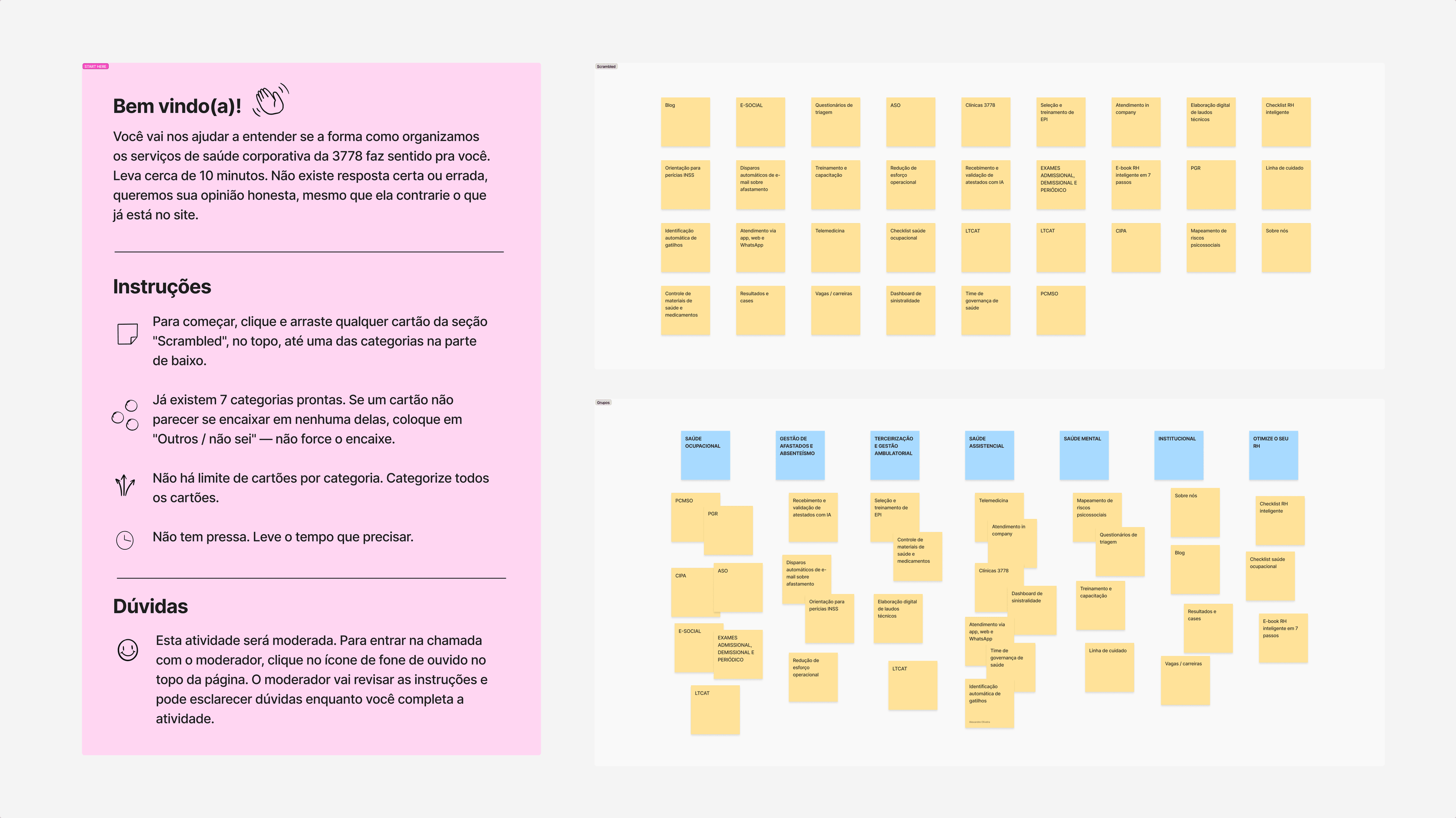
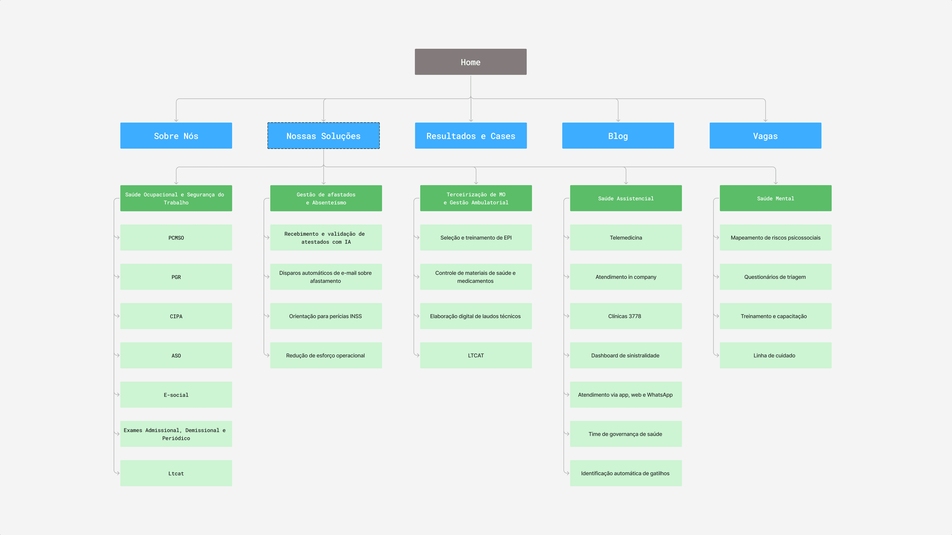
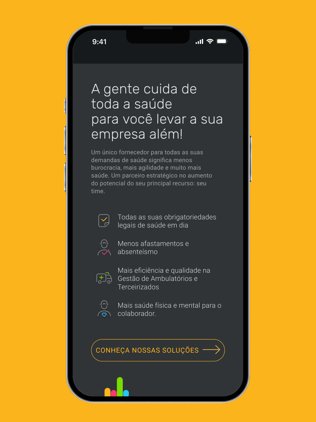
The five service lines were being presented as five separate products. I reordered them along a company's health cycle: prevention, absence, clinic, assistential care, mental health. The set now reads as one cycle rather than a catalogue.
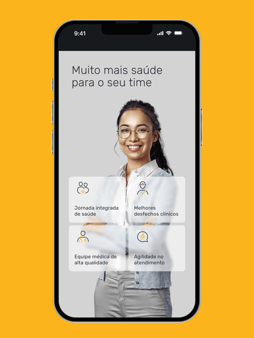
The home page was written for two people: first the benefit to whoever uses the service, the employee; then the benefit to whoever signs the contract, the manager. In corporate health they aren't the same person.
And the visual became a rule, not a screen: each color with a job, one of them reserved for the action alone. The component library came before any final screen.
SOLUTION
A form that qualifies instead of just collecting
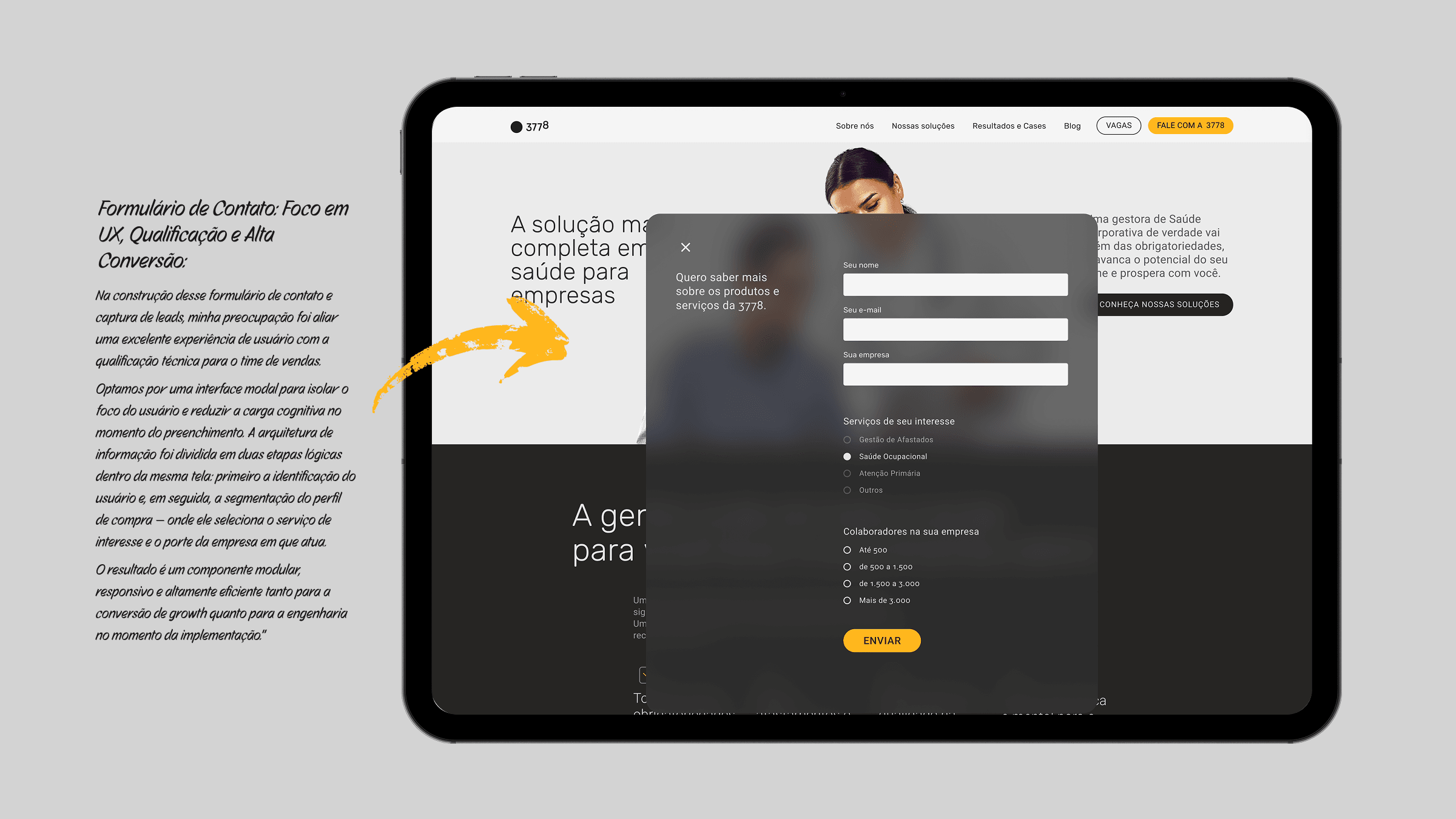
The main contact point became a modal with two steps on the same screen: identification first, with name, e-mail and company; qualification after. Three questions do that work: headcount bracket, service line of interest, and region. The e-mail field only accepts a corporate domain.
That way the lead reaches sales already routed: the bracket signals account size, the subject decides which team picks it up, the region says whether there is a local operation.
Every piece of that came out of the same library: the fields, the error states, the success screens and the cookie opt-in, all mapped to tokens and documented in Figma with behavior, responsiveness and accessibility specs.
MY ROLE
From discovery to handoff, end to end
I was the only designer on the project. I ran the benchmarking, the interviews and the analysis, defined the information architecture, built the design system, prototyped in high fidelity and wrote the documentation: the entire product design cycle.
Engineering took over from the handoff, in charge of the code and the implementation of the screens in production.

IMPACT
The offer reads, and the lead arrives sorted
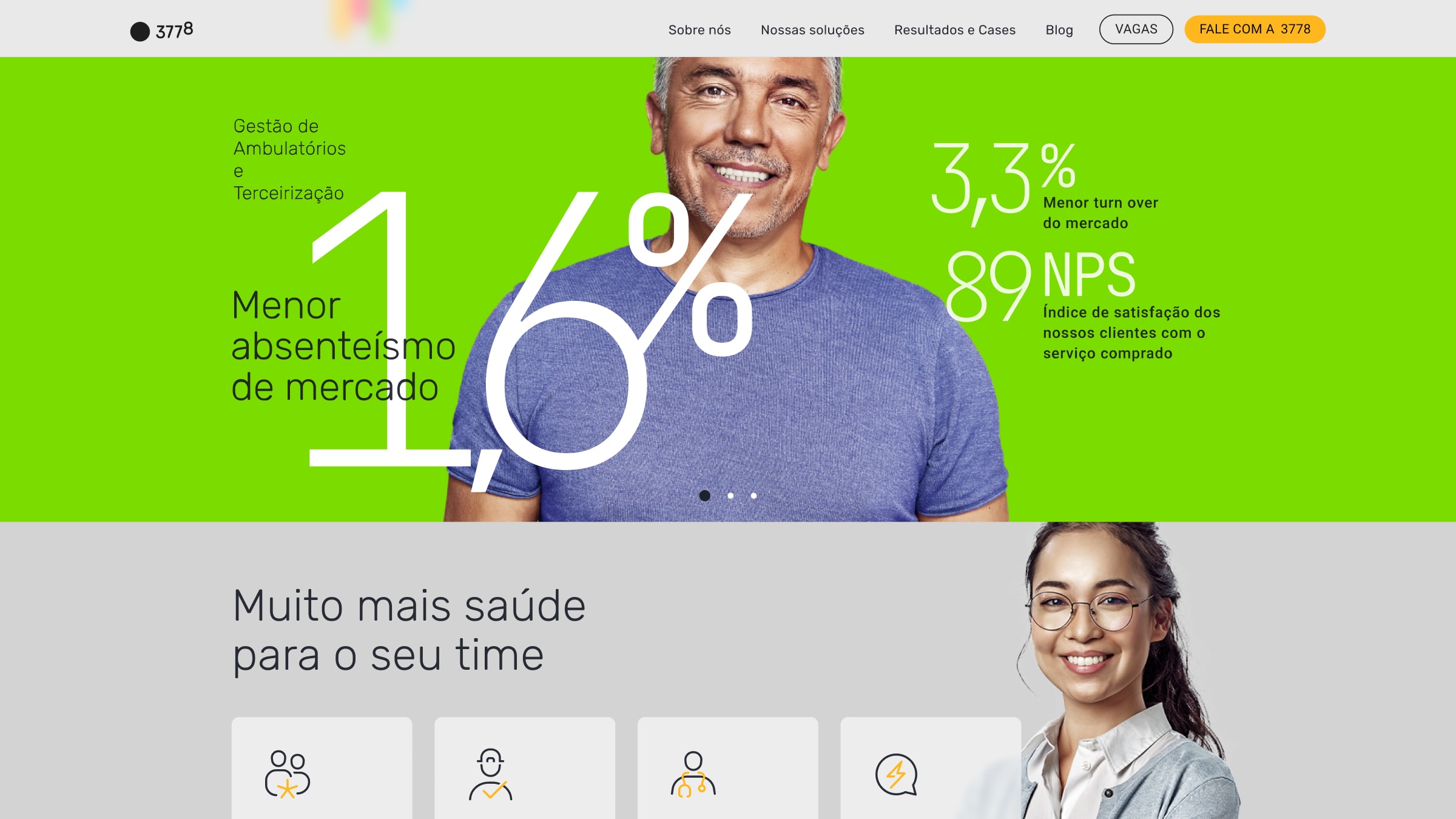
The offer stopped requiring the sector's vocabulary to be understood, and contact stopped being one rigid form. On the inside, sales stopped receiving an undifferentiated queue.
In the first month live, Analytics showed more leads coming through the form and longer time on page than the previous version.
The handoff also ran straight through: every screen was a documented page, and the team implemented from the spec without reinterpreting the interface along the way.
OUTCOME
What to ask comes before how it looks
What stayed with me has less to do with the screens than with the shape of the delivery: a documented system takes interpretation out of the path, and the design arrives ready to be built.
Redesigning the pages as asked would have cost the same effort and handed back the same illegible product, better looking. What changed the result was working on what the page said, and the order it said it in, before deciding how it would look.